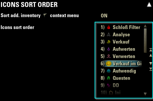
Order ListBox
This widget is not included into LibAddonMenu and needs to be separately download from www.esoui.com:
https://www.esoui.com/downloads/info3080-LibAddonMenu-OrderListBoxwidget.html
- Button to move a selected entry 1 up
- Button to move a selected entry 1 down
- Button to move a selected entry to the top
- Button to move a selected entry to the bottom
- All buttons can be disabled via the orderListBoxData table
- Drag & drop of an entry (up and down)
- Show dragged list entry text as label near the cursor
- Auto scroll up/down if dragging entries to the upper/lower part of the list
- Drag & drop can be disabled via the orderListBoxData table
- Show number of position in front of the text of an entry
- Number of position is disabled by default via the orderListBoxData table
- Show value of entry after the entry text (surrounded by [])
- Show value of entry after the tooltip text of an entry (surrounded by [])
- Show button to open a "add new entry" dialog with multiple features (ZO_Dialog textbox with validation function, maxInputCharacters etc.) Alternatively Show button to open a custom "add new entry" dialog with your own customControl and a customSetupFunction to populate the dialogs controls data etc.)
- Show button to delete a selected entry (with "ask before" dialog, or w/o).
| property | type | default | required | description |
|---|---|---|---|---|
| type | string | - | yes | The widget type of this control ("orderlistbox") |
| name | string | - | yes | My OrderListBox", string id or function returning a string |
| getFunc | function | - | yes | function() return db.listEntries, -- (table containing the list entries) |
| setFunc | function | - | yes | function(orderedListEntries) db.listEntries = orderedListEntries |
| tooltip | number, string, function | nil | no | "OrderListBox's tooltip text.", or string id or function returning a string |
| width | string | "full" | no | "full" or "half" width in the panel |
| isExtraWide | boolean | false | no | Draws the listbox extra wide |
| minHeight | number | 125 | no | number for the minimum height of this control. Standard is (rowMinHeight = 25) multiplied by 5 |
| maxHeight | number | 125 | no | number for the maximum height of this control. Standard is (minHeight) |
| rowHeight | number | 25 | no | function() return db.rowHeightNumber end, --or number for the height of the row of the entries in listEntries. Default: 25 (optional) |
| rowTemplate | String | "LAM2_Orderlistbox_ Widget_Scrolllist_Row" |
no | String or function returning String defining the XML virtual template control for a row of the listEntries (optional) Make sure to add the handlers OnDragStart and OnReceiveDrag to your virtual row template! Check XML file LAM2_orderlistbox_widget.xml, virtual control "LAM2_OrderListBox_Widget_Scrolllist_Row" as template! |
| rowFont | String | "ZoFontWinH4" | no | String or function returning a String of the font to use for the row (optional), |
| rowMaxLineCount | number | 1 | no | Number or function returning a number of the maximum text lines within the row. 1 = Only 1 text line, no wrapping, get's truncated. (optional) |
| rowSelectionTemplate | String | "ZO_ThinListHighlight" | no | String or function returning a String defining the XML virtual template control for the selection at a row of the listEntries (optional) |
| rowSelectedCallback | function | nil | no | function doStuffOnSelection(rowControl, previouslySelectedData, selectedData, reselectingDuringRebuild) end, An optional callback function when a row of the listEntries got selected. The standard selection callback function, adding the selection XML template, will always run BEFORE this optional one (optional) |
| rowHideCallback | function | nil | no | function doStuffOnHide(rowControl, currentRowData) end, An optional callback function when a row of the listEntries got hidden (optional) |
| dataTypeSelectSound | String | "NONE" | no | String or function returning a String of a sound from the global SOUNDS table. Will be played as any row containing the datatype (1) of the orderListBox will be selected (optional) |
| dataTypeResetControlCallback | function | nil | no | function doStuffOnReset(control) end, An optional callback function when the datatype control gets reset. (optional) |
| disableDrag | boolean, function | false | no | boolean or function returning a boolean (optional). Disable the drag&drop of the rows |
| disableButtons | boolean, function | false | no | function returning a boolean (optional). Disable the move up/move down/move to top/move to bottom buttons |
| showPosition | boolean, function | false | no | or function returning a boolean (optional). Show the position number in front of the list entry |
| showValue | boolean, function | false | no | or function returning a boolean (optional). Show the value of the entry after the list entry text, surrounded by [] |
| showValueAtTooltip | boolean, function | false | no | or function returning a boolean (optional). Show the value of the entry after the tooltip text, surrounded by [] |
| addEntryDialog | table, function | nil | no | { title="Add new entry", text="Enter new text here", textType=TEXT_TYPE_ALL, buttonTexture="", maxInputCharacters=0, specialCharacters={"a", "b", "c"}, selectAll=false, defaultText="Type text here", validatesText=false, validator = function(text) return type(text) == "string" end, instructions=table (example See line below) } or function returning a table (optional). If the table exists: Add an "Add value" button to the list which opens a dialog. Inside the table you can pass in additional data and options to the ZO_Dialog dialog, e.g. title, text, editbox in dialog only accepts digits -> TEXT_TYPE_NUMERIC_UNSIGNED_INT, and other custom data --> example instructions = ZO_ValidNameInstructions:New(GetControl(self, "NameInstructions"), nil, { NAME_RULE_TOO_SHORT, NAME_RULE_CANNOT_START_WITH_SPACE, NAME_RULE_MUST_END_WITH_LETTER }) |
| addCustomEntryDialog | table, function | nil | no | { title="Add new entry", buttonTexture="", customAddFunction = function(orderListBox, dialog) get new entry data from custom dialog XML controls and return text, value end, customSetupFunction = function(orderListBox, dialog) get the dialog's child controls which your XML tempalte added and populate entries into them, e.g. a dropdown/ZO_ComboBox end, validator = function(text) return type(text) == "string" end, XMLtemplate = "MyGlobalXMLDialogTemplateWithTitleAndCustomControls_InheritedFrom_ZO_CustomDialogBase_with_Accept_and_Cancel_buttons", } or function returning a table (optional). If the table exists: Add an "Add value" button to the list which opens a custom XML dialog, with your XML template. The dialog has 2 buttons, 1 for accept and 1 for decline. It can have custom controls like a dropdown/slider/exitBox. You must specify a customAddFunction(orderListBoxObject, dialog) which returns text, value of the new added entry! |
| addEntryCallbackFunction | function | nil | no | function(orderListBox, newAddedEntry, orderListBoxData) return true end, -- (optional) function returning a boolean (true = added, false = not added) called as the entry get's added |
| showRemoveEntryButton | boolean, function | false | no | or function returning a boolean (optional). Show a button to remove the currently selected entry |
| askBeforeRemoveEntry | boolean, function | false | no | or function returning a boolean (optional). If showRemoveEntryButton is enabled: Ask via a dialog if the entry should be removed |
| removeEntryCheckFunction | function | nil | no | function(orderListBox, selectedIndex, orderListBoxData) return true end, -- (optional) function returning a boolean (true = remove, false = keep) if the entry can be removed or not |
| removeEntryCallbackFunction | function | nil | no | function(orderListBox, selectedEntry, orderListBoxData) return true end, -- (optional) function returning a boolean (true = removed, false = not removed) called as the entry get's removed |
| disabled | boolean, function | false | no | Determines if the order listbox is disabled and its value cannot be changed |
| requiresReload | boolean | false | no | Appends a special warning text and shows a reload button if the value is changed |
| default | number, function | nil | no | listEntries = defaults.listEntries , table of default date values (or default = defaultEntries, where defaultEntries is a table with the list entries) or a function that returns the list entries |
| helpUrl | string, function | - | no | A string URL "https://www.esoui.com", or a function that returns one |
| reference | string | nil | no | A unique global reference to the control |
settings.iconSortOrderEntries = {
        [1] = {
            value = "Value of the entry 1", -- or number or boolean or function returning the value of this entry
            uniqueKey = 1, --number of the unique key of this list entry. This will not change if the order changes. Will be used to identify the entry uniquely
            text  = "Text of this entry 1", -- or string id or function returning a string (optional)
            tooltip = "Tooltip text shown at this entry 1", -- or string id or function returning a string (optional)
        },
        [2] = {
            value = "Value of the entry 2", -- or number or boolean or function returning the value of this entry
            uniqueKey = 2, --number of the unique key of this list entry. This will not change if the order changes. Will be used to identify the entry uniquely
            text  = "Text of this entry 2", -- or string id or function returning a string (optional)
            tooltip = "Tooltip text shown at this entry 2", -- or string id or function returning a string (optional)
        },
}

{
    type = "orderlistbox",
    name = "Order list box 1",
    tooltip = "Tooltip of the order list box 1",
    listEntries = settings.iconSortOrderEntries,
    disableDrag = false,
    disableButtons = false,
    showPosition = false,
    getFunc = function() return settings.iconSortOrderEntries end,
    setFunc = function(sortedSortListEntries)
        settings.iconSortOrderEntries = sortedSortListEntries
        for idx, data in ipairs(sortedSortListEntries) do
            settings.icon[data.value].sortOrder = idx
            settings.iconSortOrder[idx] = data.value
        end
    end,
    width="full",
    minHeight = 250,
    maxHeight = 400,
    disabled = function() return false  end,
    reference = "MyAddon_Settings_IconSortOrder_OrderListBox",
    disabled = function() return not settings.sortIcons end,
    default = defaultSettings.iconSortOrderEntries,
            addEntryDialog = {
                title="Add new value",
                text="Enter new value here",
                textType=TEXT_TYPE_ALL,
                --buttonTexture="/esoui/art/buttons/minus_up.dds",
                --maxInputCharacters=3,
                --specialCharacters={"a", "b", "c"},
                --defaultText = "Default text",
                --instructions = ZO_ValidNameInstructions:New(GetControl(self, "NameInstructions"), nil, { NAME_RULE_TOO_SHORT, NAME_RULE_CANNOT_START_WITH_SPACE, NAME_RULE_MUST_END_WITH_LETTER })
                validatesText = true,
                validator = function(text) return text ~= nil and text ~= "" end
            },
            showRemoveEntryButton = true,
            askBeforeRemoveEntry = function() return true end
},
XML custom control and code for addCustomEntryDialog:
----Example1 - Simple label at dialog
------addCustomEntryDialog.XMLtemplate:
            <TopLevelControl name="MyGlobalXMLDialogTemplateWithTitleAndCustomControls" inherits="ZO_CustomDialogBase" mouseEnabled="true" virtual="true">
                <OnInitialized>
                </OnInitialized>
                <Controls>
                    <!-- 1 custom control label with child name "Value" here -->
                    <Label name="$(parent)Value" text="Hello!" verticalAlignment="CENTER" font="ZoFontWinH5" color="INTERFACE_COLOR_TYPE_TEXT_COLORS:INTERFACE_TEXT_COLOR_CONTEXT_HIGHLIGHT" maxLineCount="1">
                        <Anchor point="TOPLEFT" relativePoint="TOPLEFT" offsetX="0" />
                    </Label>
                    <!-- 2 default buttons - mandatory! -->
                    <Control name="$(parent)Cancel" inherits="ZO_CustomDialogButton"/>
                    <Control name="$(parent)Accept" inherits="ZO_CustomDialogButton"/>
                </Controls>
            </TopLevelControl>

------addCustomEntryDialog.customAddFunction:
            customAddFunction = function(orderListBox, dialog)
                --Get the child control "Value" -> the label
                local value = dialog:GetNamedChild("Value")
                if value then
                    --Return the label's text as newText for the entry, and the value = nil (will be set automatically to current #listEntries + 1, if missing in returned 2nd parameter)
                    return value:GetText(), nil
                end
            end,


----Example2 - ZO_Combobox at dialog
------addCustomEntryDialog.XMLtemplate:
            <TopLevelControl name="MyGlobalXMLDialogTemplateWithTitleAndCustomControls" inherits="ZO_CustomDialogBase" mouseEnabled="true" virtual="true">
                <OnInitialized>
                </OnInitialized>
                <Controls>
                    <Control name="$(parent)Value" inherits="ZO_ComboBox" mouseEnabled="true">
                        <Dimensions x="350" y="20" />
                        <Anchor point="TOPLEFT" relativePoint="TOPLEFT" offsetX="30" offsetY="60" />
                    </Control>
                    <Control name="$(parent)Cancel" inherits="ZO_CustomDialogButton"/>
                    <Control name="$(parent)Accept" inherits="ZO_CustomDialogButton"/>
                </Controls>
            </TopLevelControl>

------addCustomEntryDialog.customAddFunction:
            customAddFunction = function(orderListBox, dialog)
                local comboBox = dialog:GetNamedChild("Value")
                if comboBox then
                    d(">found combobox")
                    local dropdown = ZO_ComboBox_ObjectFromContainer(comboBox)
                    local selectedItem = dropdown:GetSelectedItemData()
                    if selectedItem ~= nil then
                        d(">found combobox selectedItemData")
                        local data = selectedItem.data or selectedItem
                        return data.label or data.name or data.guildName, data.value or data.guildId
                    end
                end
            end,

------addCustomEntryDialog.customSetupFunction:
            customSetupFunction = function(orderListBox, dialog)
                local data = dialog.data
                local comboBoxControl = dialog:GetNamedChild("Value")
                if comboBoxControl then
                    d(">found combobox")
                    local dropdown = ZO_ComboBox_ObjectFromContainer(comboBoxControl)
                    dropdown:SetSortsItems(false)
                    dropdown:SetDropdownFont("ZoFontHeader")
                    dropdown:SetSpacing(8)
                    --Add current guilds to the dropdown
                    local function OnCategorySelectionChanged(control, name, entry, selectionChanged)
                        d("Selected guild: " .. tostring(entry.name))
                    end
                    for guildIndex=1, GetNumGuilds(), 1 do
                        local guildId = GetGuildId(guildIndex)
                        local guildName = GetGuildName(guildId)
                        local entry = dropdown:CreateItemEntry(guildName, OnCategorySelectionChanged)
                        entry.guildId = guildId
                        entry.guildIndex = guildIndex
                        entry.name = guildName
                        dropdown:AddItem(entry, ZO_COMBOBOX_SUPPRESS_UPDATE)
                    end
                end
            end,

]]