Building an interactive webpage to provide data visualizations and analysis relating to 'social vulnerability' in Alameda County, Ca.
Collaborators: Daniel Rodriguez, Luis Hernandez, Lorela Cabral, and Drew Barnhart.
The data utilized was retrieved from Ca.Gov within a section titled "California Open Data Portal." We utilized a file initially created by the California Department of Water Resources. This data was created using 2020 census geogrpahic block groups as the units of analysis. The initial goal of this data was to: "Provide a spatial representation of social and economic factors that can affect water shortage vulnerability in the state of California." The files we used were the CSV and GeoJSON files. We predominanlty focused on Alameda county.
Source: https://data.ca.gov/dataset/i07-water-shortage-social-vulnerability-blockgroup
Data and Delivery
- Create a data and delivery system incorporating a dataset with at least 100 records (ours had over 23,000!)
- Integrate this inforamtion into a database to house the data
- The project is powered by a Python Flask API and includes HTML/CSS, JavaScript, and the chosen database.
Back End & Visualizations
- The page is created to showcase data visualizations
- A minimum of three unique views present the data.
- Multiple user-driven interactions
- Read the GeoJSON data within a jupyter notebook
- Grab the data and filter the appropriate columns
- Generate this information within a DataFrame
- Narrow down our data to only Alameda County (create a more manageable data set to work with)
- Create a SQLite database
- Pushing inforamtion to SQLite and created a table of our data with a final length of 1,074 rows.
- Create data URL
- Grab all the data
- jsonyfying all rows
- sneding all the information to a local host
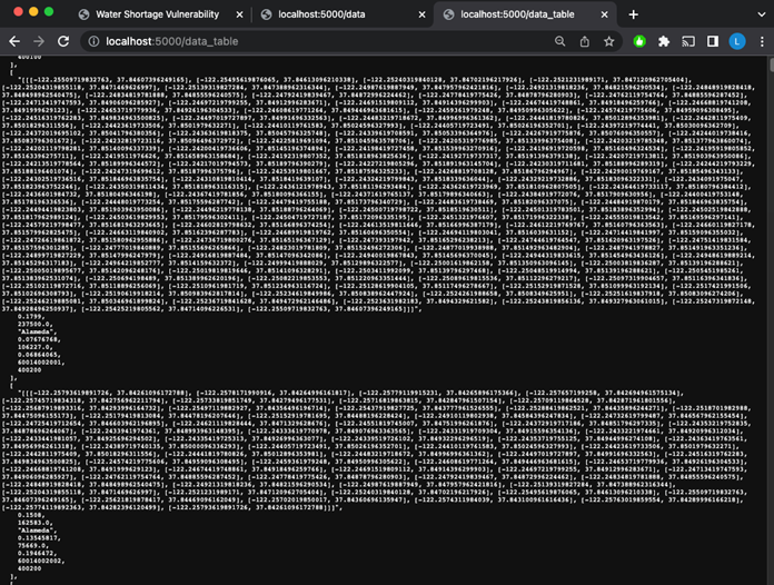
- Our Flask app served the data from the SQlite database to two locations: 5000/data & 5000/data_table
- index.html
- One group of isolated data (5000/data) was used to create polygons. These Polygons created an outline of the geographic sections within Alameda County. This data contained the Latitude and longitude cordinaates (which accounted for a substantial portion of the data).
- The other data table (5000/data_table) we created removed the lat/long and focused mainly on other columns that were pertinent to our analysis. This mad ethe data significntly more manageble and easier to load & make alterations
- Integrated a polygon layer which displayed outlines of geogrpahic information divided into townships/ranges within Alameda County. these townships/ranges were identified by a unique GeoID/identifier.
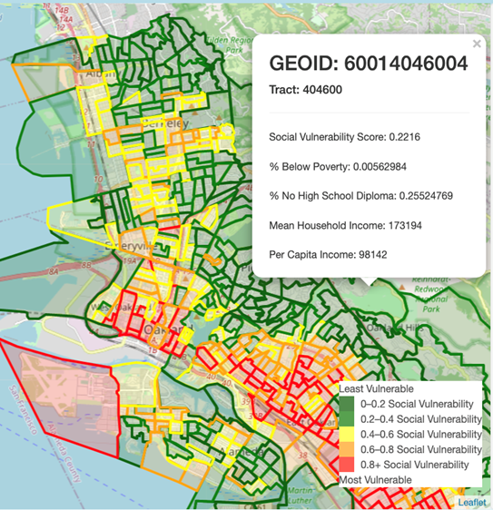
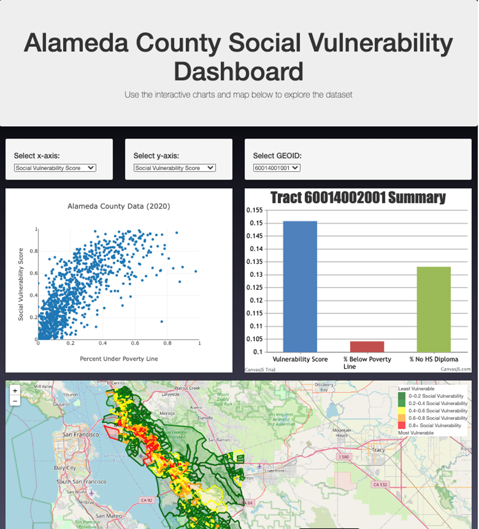
- This dropdown menu enabled interface by allowing the user to select from a drop down list to see the information pertaining to a specific section within Alameda County.
- We integrated a 'hover feature' that served a simialr purpose. This feauture allowed the user to see the relevant information pertaining to each specific township/range within Alameda County.
- One of the columns we initially integrated into our DataFrame was that of social vulnerability. At a cursory level, this metric captured an areas susceptibility to climate or environmentally induced change and the adverse effect/impact this could have on the areas' population.
- a score of 1 represented the msot susceptible, While a score of 0 was the least susceptible.
- we created bins of .2 increments with a dark green to red color scale to make the data and polygons eaier to interpret.
- Red indicated an area that was most vulnerable, while green was an area that was relatively resilient.
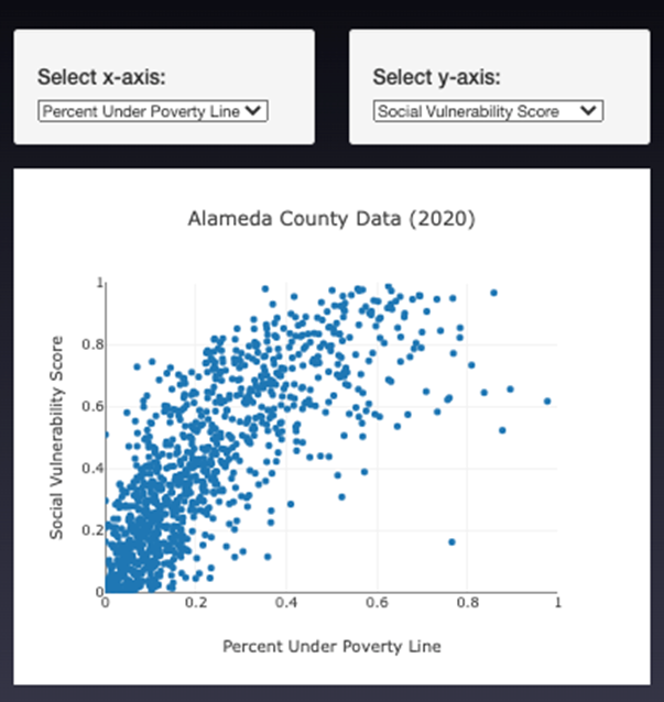
- An additional analysis we thought would be valuable was utilizing a scatterplot to compare a few sections of our data. ]
- Our scatterplot compared the Social Vulnerability and Median Household Income We eventually expanded this to be interactive where the user could select the X & Y axis variables to create their own comparative analysis.
- The wells for selecting the x and y axis allow the user to choose which factors they want to plot.
- Plotly was used to plot the scatter plot based on the user’s choice of axes.
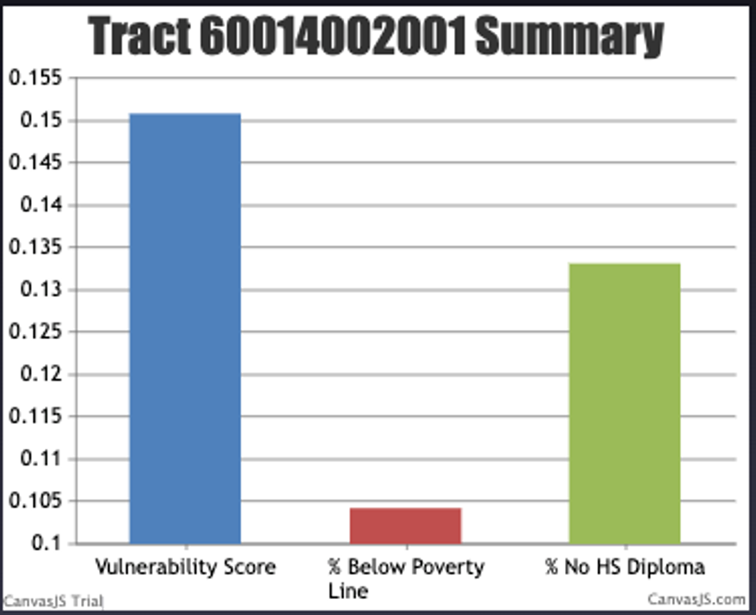
- To create the bar chart, we used a similar for loop to store the data as lists.
- For this chart, the user can select which GEOID they want to graph.
- This will show comparisons between the Vulnerability Score, % between poverty line, and % no high school diploma.
- Canvas.js was used to plot the bar chart.
- From the scatter plot and observations we were able to deduce that there is a strong inversely proportionate relationship between median household income and social vulnerability. Meaning that the higher the total household income, typically yielded the lower susceptibility to climate induced issues like water shortgages. This was somewhat anticipated as those with financial affluence can generally allocate more resources for development and improvemnt of infrastructure. Some areas were annomalies to this conclusion In several "GeoId's" we noticed that the income did NOT relate to the vulnerability. This could be attributed to tourist destinations.
- There were several limitations associated with our data. The first limitation is the fact that our data is from 2020, this doesnt factor in the recent record rainfall and snow pact that has had significant effects on water supplies in California, especially Alameda county. An additional limitation is the fact that the census data is voluntarily provided and self reported. Meaning the data regarding mean household income could be incorrect and lead to a false narration. A final limittion we experienced was the copious size of our data. The initial data was over 23000 rows! this was immensely difficult to manage, load and work with.
- Antiquated: The data collected ranges from 2015-2019 (indicators from the American Communities Survey) and 2020 (Census Block Groups), so they may not be as accurate today.
- Self Reported: US census data is self reported and majority of the information is unverified. Statistics in our data/analysis (especially household income) is susceptible to being over/under exaggerated.
- Other Interactions: Further visualizations to add to our data could be made by linking plots together. For example, being able to click on a data point in the scatter plot and making it highlight the corresponding polygon on the map.
Statistical Analysis: Likewise, we can run statistical tests (such as linear regression) with the data to determine if there is a correlation between socioeconomic factors and Water Shortage Social Vulnerability.
- to_sql
- Python
- SQLite
- HTML
- Pandas
- Numpy
- Javascript
- CSS
- Jupyter Notebook
- GitHub
- DataFrame
- sort_values
- Append
- astype
- create_engine
- Execute
- Return
- Select
- Jsonify
- Call
- Catch
- pyplot