Ahoy, per the design we need a new cute little dropdown button. Here's a working example:
https://mui.com/components/button-group/#split-button
Note, that there are indeed 3 handlers:
- Click Main Button (if undefined, style the button so it opens up the dropdown)
- Click Menu Item (do something)
- Click Away (cleanup function that'll run when the other clicks away from the modal)
Suggested props:
// Options should separate between value (anything) and string (which can be translated later)
// But can just be strings for simplicity and then we touch only the index
type Option<T> = {display: string, value: T} | string
interface SplitButtonProps<T> {
options: Option<T>[];
defaultSelected?: number;
onMainClick: (e, index: number, value: T) => void;
onItemClick: (e, index: number, value: T) => void;
onOutSideClick: (e) => void;
// Open+close icons
// Defaulting to our cute arrows
icons: [ReactNode, ReactNode | null];
children: ReactNode | undefined;
// Styling the menu is tricky, because the example uses a Portal.
// Safer to just pass a render function and a className
menuClassName: string;
renderMenu: ({children: ReactNode, onClick: (e, index: number, value: T) => void}) => ReactNode
// This'll be the className for the ButtonGroup itself
className: string;
...delegated: any;
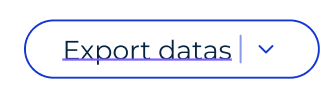
}Design:
(Ignore the underscore, that's just figma being an ass)
Ahoy, per the design we need a new cute little dropdown button. Here's a working example:
https://mui.com/components/button-group/#split-button
Note, that there are indeed 3 handlers:
Suggested props:
Design:
(Ignore the underscore, that's just figma being an ass)