Revise styling for paywall page for template app #42
Description
Problem Statement
Currently, the default styling for the paywall page as part of the app looks like this:
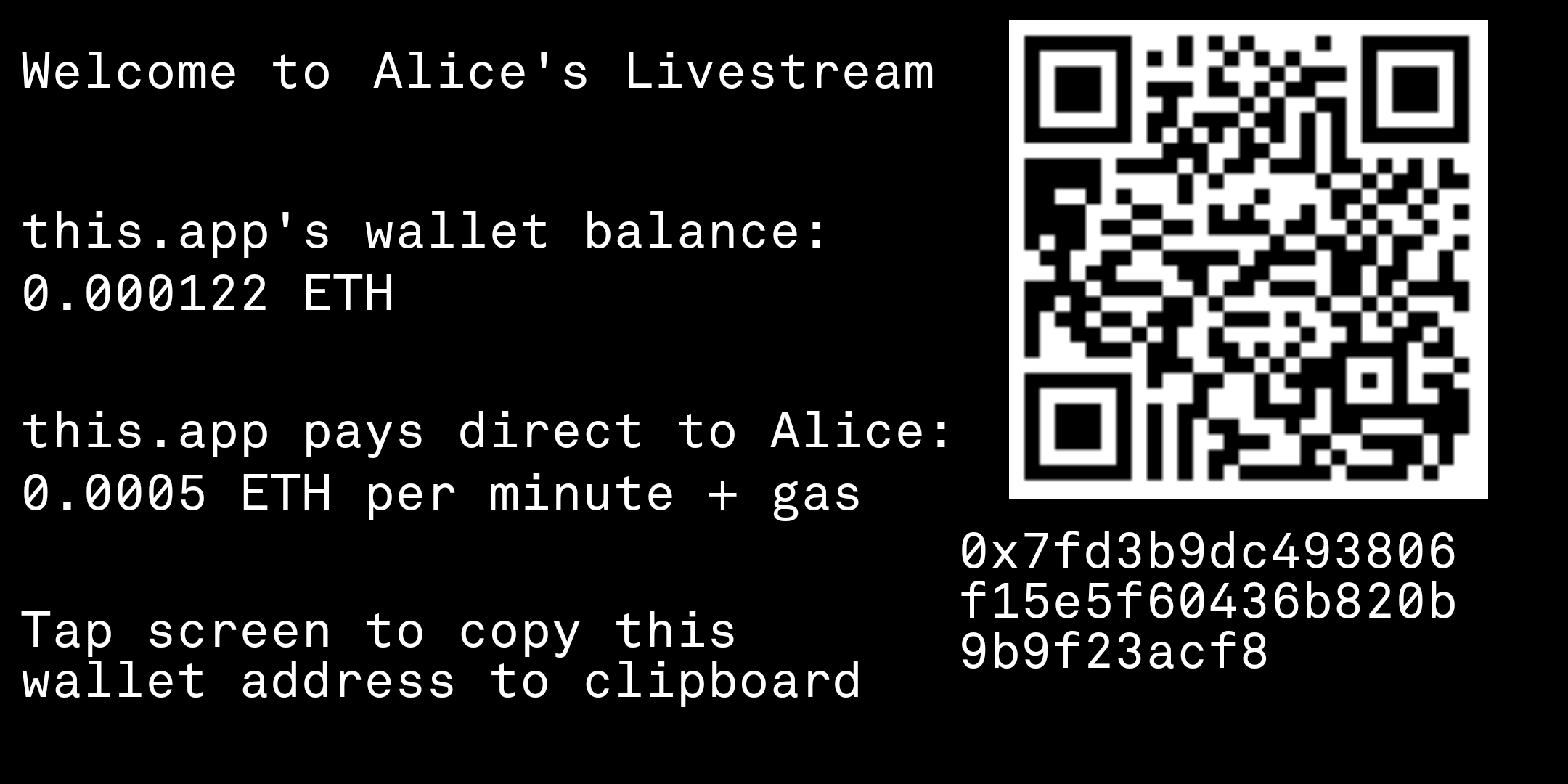
This user interface has been described by one contributor as "terrible", "nerdy" and "will alienate most artists".
Proposed Solution
Someone with some graphic design skills come up with an improved default layout for this page.
Here are the requirements:
- The page must display at least the following information:
- QR code + Address
- App's balance
- Instructions to save app's address to clipboard
- How much it costs to watch