
Native Date, Time, Datetime and Yearmonth Picker
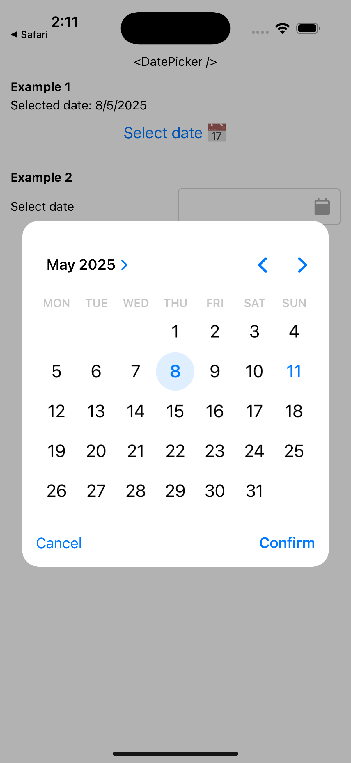
- 📅 Date picker
- 🕜 Time picker
- 🗓️ Datetime picker
- 🌙 Yearmonth picker
- 🔌 Supports iOS, Android and Web
- 🎯 Selection is single and multiple
- 💎 Renders in modal and inline
- ✨ Highly customizable
| iOS | Android | mWeb - Safari | mWeb - Chrome | Web - Chrome |
|---|---|---|---|---|
 |
 |
 |
 |
 |
See it in action
demo.mp4
-
Using
npmnpm install @s77rt/react-native-date-picker
-
Using
yarnyarn add @s77rt/react-native-date-picker
import { DatePicker } from "@s77rt/react-native-date-picker";
import type { DatePickerHandle } from "@s77rt/react-native-date-picker";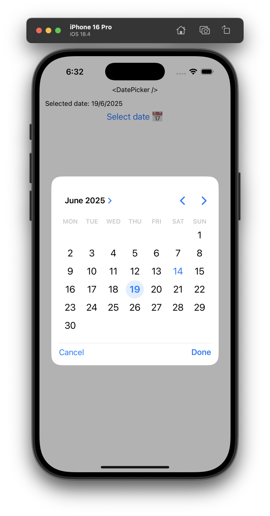
function Example() {
const datePicker = useRef<DatePickerHandle>(null);
const [selectedDate, setSelectedDate] = useState<Date | null>(null);
return (
<>
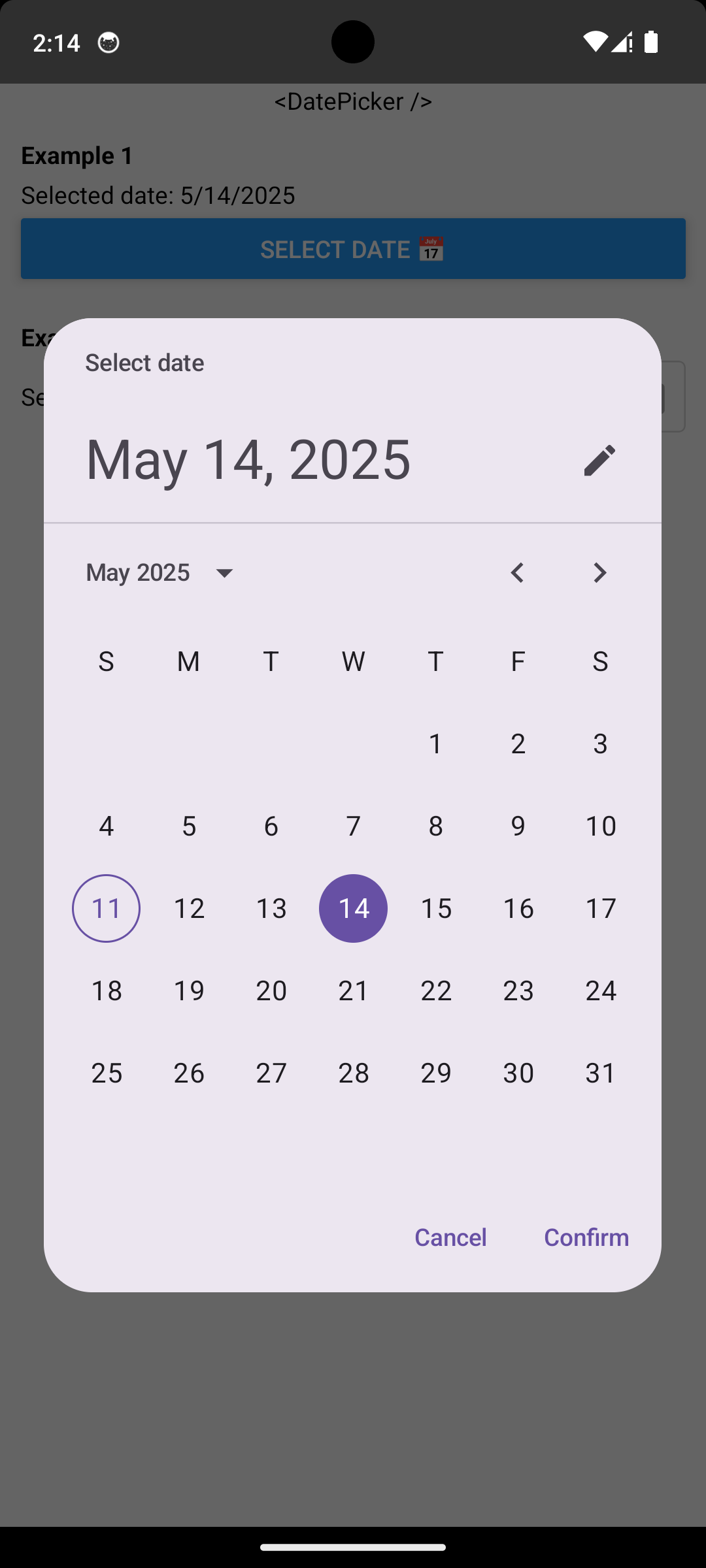
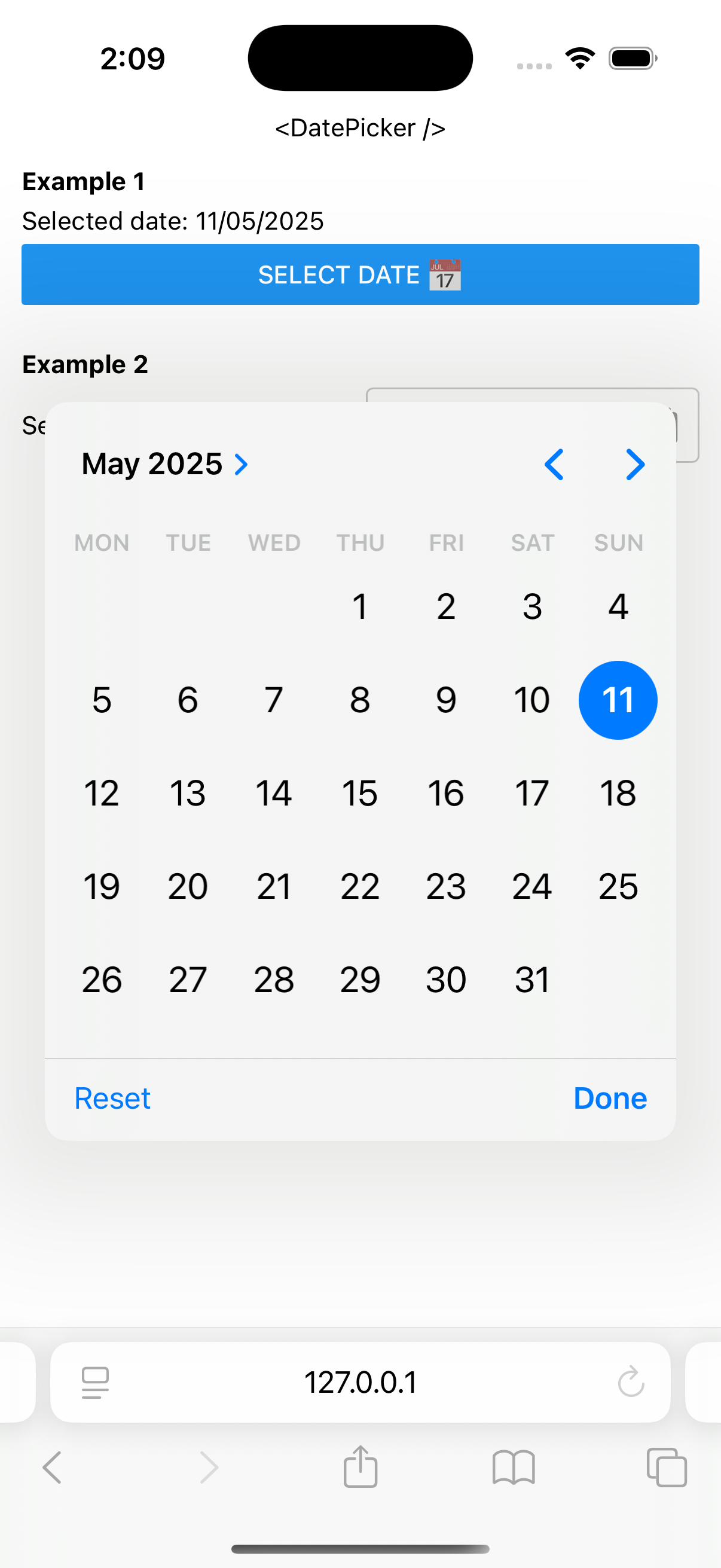
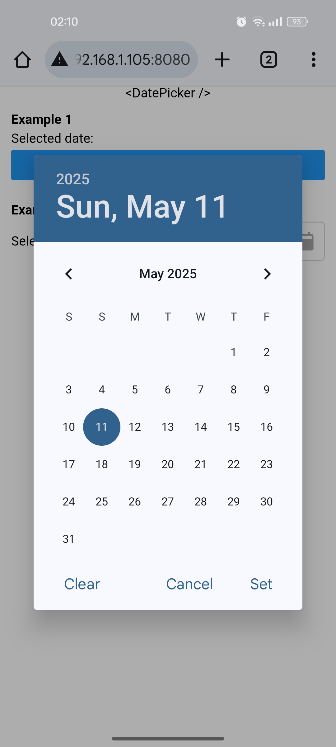
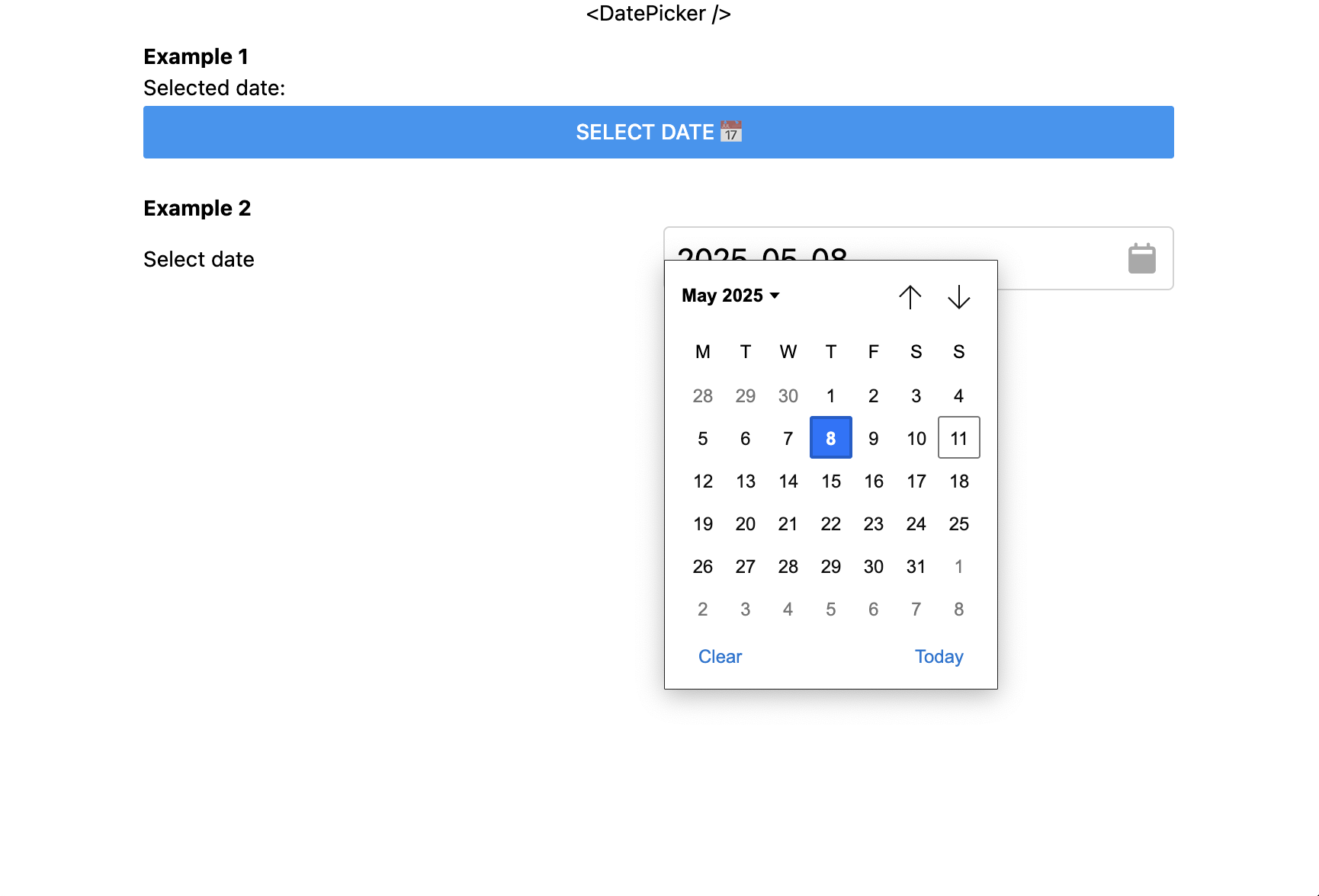
<Text>Selected date: {selectedDate?.toLocaleDateString()}</Text>
<View>
<Button
title="Select date 📅"
onPress={() => datePicker.current?.showPicker()}
/>
<DatePicker
ref={datePicker}
type="date"
value={selectedDate}
onChange={setSelectedDate}
/>
</View>
</>
);
}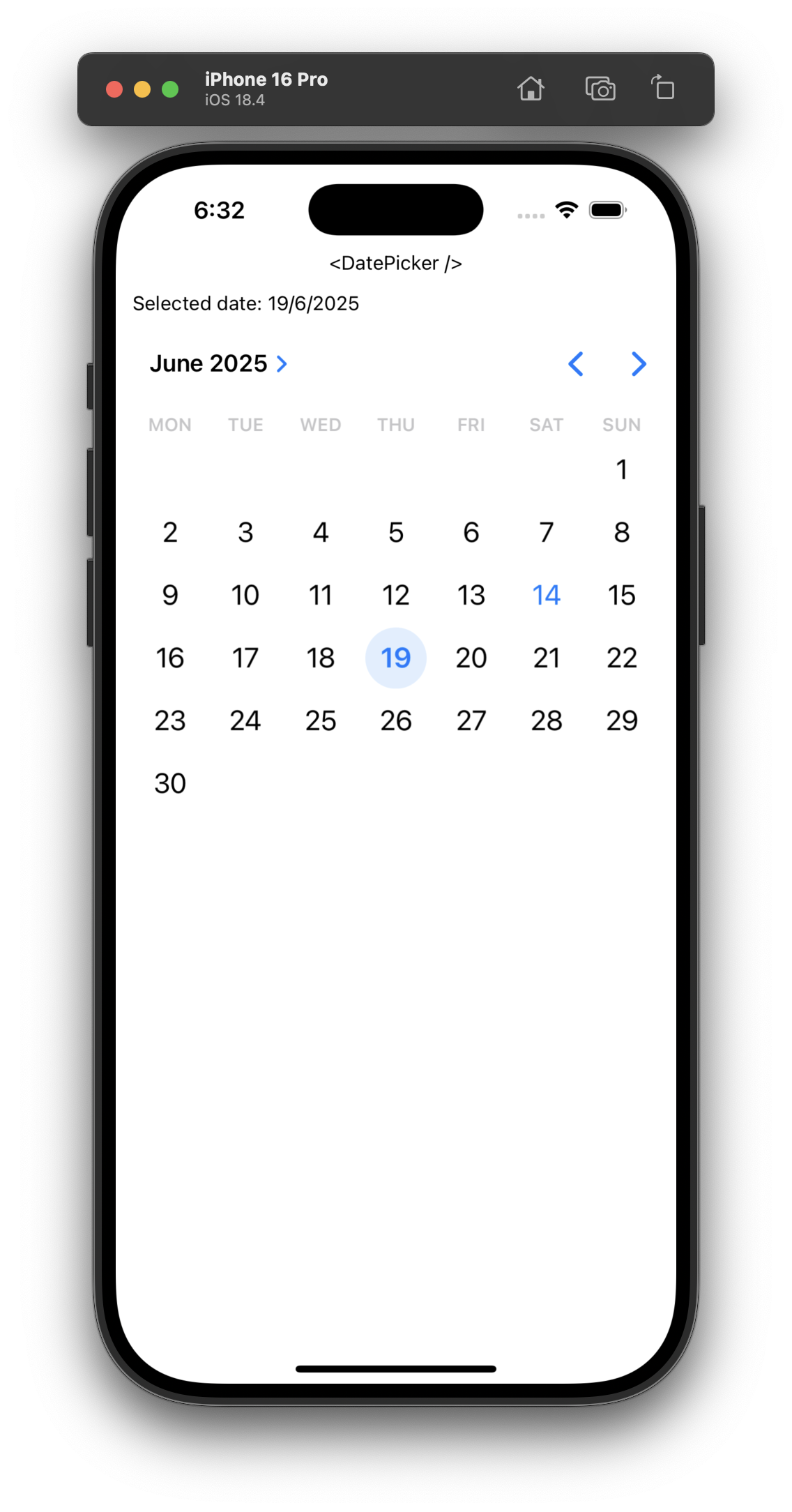
function Example() {
	const [selectedDate, setSelectedDate] = useState<Date | null>(null);

	return (
		<>
			<Text>Selected date: {selectedDate?.toLocaleDateString()}</Text>
			<DatePicker
				type="date"
				value={selectedDate}
				onChange={setSelectedDate}
				inline
			/>
		</>
	);
}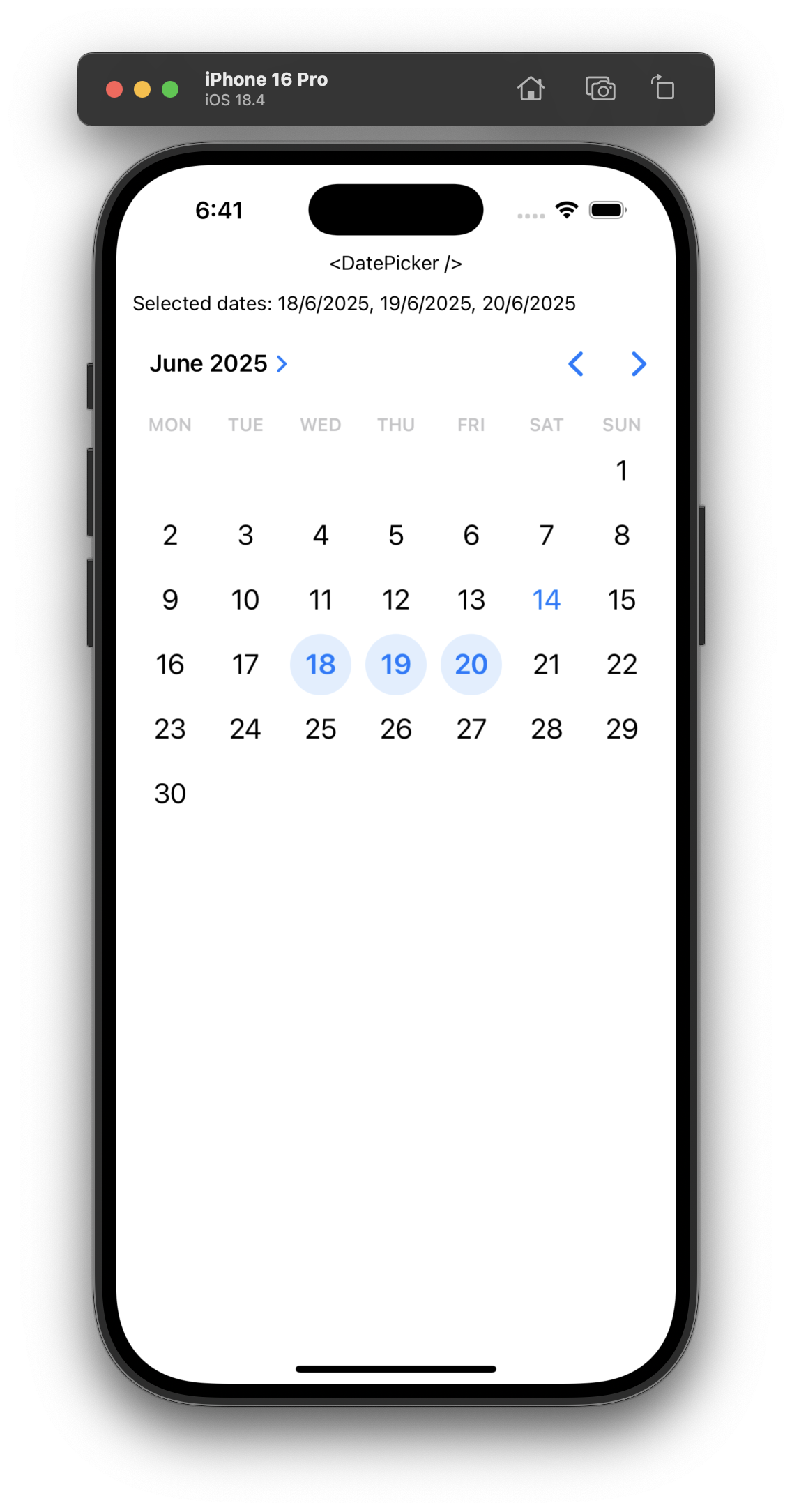
function Example() {
	const [selectedDates, setSelectedDates] = useState<Date[]>([]);

	return (
		<>
			<Text>
				Selected dates:{" "}
				{selectedDates
					?.map((date) => date.toLocaleDateString())
					.join(", ")}
			</Text>
			<DatePicker
				type="date"
				value={selectedDates}
				onChange={setSelectedDates}
				multiple
				inline
			/>
		</>
	);
}Inherits View Props.
| Prop | Type | Description |
|---|---|---|
ref |
Ref<DatePickerHandle> |
Ref for the date picker handle. |
type |
Type |
The type of the picker. |
value |
Date | nullDate[] |
The selected date(s). |
onChange |
(value: Date | null) => void(value: Date[]) => void |
Callback when the user changes the selected date(s). |
min |
Date |
The earliest selectable date(s). |
max |
Date |
The latest selectable date(s). |
step |
number |
The stepping interval, in seconds. ⚫🔵 |
multiple |
boolean |
Whether the user can select multiple dates. ⚫🟢 |
inline |
boolean |
Whether the date picker should be displayed inline. ⚫🟢 |
options |
Options |
Options. Note: Must be memoized (useMemo). ⚫🟢 |
styles |
Styles |
Styles. Note: Must be memoized (useMemo). ⚫🟢 |
The type of the picker and can be one of the following:
datetimedatetime⚫🔵yearmonth
Various configuration options.
| Option | Type | Description |
|---|---|---|
locale |
string |
The locale BCP-47 identifier. ⚫ |
confirmText |
string |
The confirm button text. ⚫🟢 |
cancelText |
string |
The cancel button text. ⚫🟢 |
mode |
"compact" | "graphical" | "wheel" |
The display mode. ⚫ |
title |
string |
The title. 🟢 |
headline |
string |
The headline. 🟢 |
showModeToggle |
boolean |
Whether the mode toggle should be shown. 🟢 |
is24Hour |
boolean |
Whether the time should be in 24-hour. 🟢 |
Look and feel styles.
| Style | Type | Description |
|---|---|---|
accentColor |
ColorValue |
The accent color. ⚫ |
containerColor |
ColorValue |
The container color. 🟢 |
titleContentColor |
ColorValue |
The title color. 🟢 |
headlineContentColor |
ColorValue |
The headline color. 🟢 |
weekdayContentColor |
ColorValue |
The weekday letters color. 🟢 |
subheadContentColor |
ColorValue |
The month and year subhead labels color. 🟢 |
navigationContentColor |
ColorValue |
The year and arrow buttons color. 🟢 |
yearContentColor |
ColorValue |
The year color. 🟢 |
disabledYearContentColor |
ColorValue |
The disabled year color. 🟢 |
currentYearContentColor |
ColorValue |
The current year color. 🟢 |
selectedYearContentColor |
ColorValue |
The selected year color. 🟢 |
disabledSelectedYearContentColor |
ColorValue |
The disabled selected year color. 🟢 |
selectedYearContainerColor |
ColorValue |
The selected year container color. 🟢 |
disabledSelectedYearContainerColor |
ColorValue |
The disabled selected container color. 🟢 |
dayContentColor |
ColorValue |
The day color. 🟢 |
disabledDayContentColor |
ColorValue |
The disabled day color. 🟢 |
selectedDayContentColor |
ColorValue |
The selected day color. 🟢 |
disabledSelectedDayContentColor |
ColorValue |
The disabled selected day color. 🟢 |
selectedDayContainerColor |
ColorValue |
The selected day container color. 🟢 |
disabledSelectedDayContainerColor |
ColorValue |
The disabled selected day container color. 🟢 |
todayContentColor |
ColorValue |
The today color. 🟢 |
todayDateBorderColor |
ColorValue |
The today border color. 🟢 |
dayInSelectionRangeContainerColor |
ColorValue |
The selected days container color. 🟢 |
dayInSelectionRangeContentColor |
ColorValue |
The selected days color. 🟢 |
dividerColor |
ColorValue |
The divider color. 🟢 |
clockDialColor |
ColorValue |
The clock dial color. 🟢 |
selectorColor |
ColorValue |
The clock dial selector color. 🟢 |
periodSelectorBorderColor |
ColorValue |
The period selector border color. 🟢 |
clockDialSelectedContentColor |
ColorValue |
The selected number color. 🟢 |
clockDialUnselectedContentColor |
ColorValue |
The unselected number color. 🟢 |
periodSelectorSelectedContainerColor |
ColorValue |
The selected period container color. 🟢 |
periodSelectorUnselectedContainerColor |
ColorValue |
The unselected period container color. 🟢 |
periodSelectorSelectedContentColor |
ColorValue |
The selected period color. 🟢 |
periodSelectorUnselectedContentColor |
ColorValue |
The unselected period color. 🟢 |
timeSelectorSelectedContainerColor |
ColorValue |
The selected time container color. 🟢 |
timeSelectorUnselectedContainerColor |
ColorValue |
The unselected time container color. 🟢 |
timeSelectorSelectedContentColor |
ColorValue |
The selected time color. 🟢 |
timeSelectorUnselectedContentColor |
ColorValue |
The unselected time color. 🟢 |
Imperative handle methods.
| Method | Type | Description |
|---|---|---|
showPicker |
() => void |
Shows the picker. |
Every code review, bug report and feature request is appreciated! Please feel free to share your feedback.
⚫ iOS - 🟢 Android - 🔵 Web